Hello everyone! This is Tyler Babip (Tyler Babbie in real life), checking in with my first post for TalkNats.
I am a graduate student, and this summer I got a fellowship to make some maps for a website using software called Tableau, which is also good for making graphs and charts. A couple weeks ago I posted that the Nats had, as a team, done a great job scoring more than one WAR per month, according to Fangraphs. After some of you liked my comment (thanks!), Ghost suggested I make a post about it. I decided to use Tableau to make a chart.
I recommend opening it in a different tab or window for now to get the full view. Here’s a link: HERE
How the chart works:
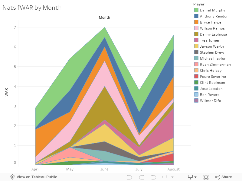
Each colored bar corresponds to a position player on the Nats who has made a positive contribution, as measured by WAR, at least once in a one month period this season. That means Ben Revere appears, even though he’s only contributed 0.1 WAR, the least possible amount to get on the chart–and he only managed it one time, in June. I didn’t chart negative WAR because, well, I’m staying positive, and more importantly, negative WAR made the chart act funny. I could do a negative graph in the future, but it seems like inviting bad feelings. I also want to make a chart for last season, once I get past my next dissertation deadline.
Once you’re on the page with the chart, hover your cursor over a line to see who it belongs to. You can also go to the sidebar and click on a guy to see his line. That’s helpful when the particular player’s line is very small.
The lines are stacked in the order of the total WAR per player—Daniel Murphy’s on top, followed by Anthony Rendon, because they’ve got the most WAR (so they also have the fattest bars on the graph). Credit to Ghost for the idea to put the lines in order. Here’s a link to the overall leaderboards on Fangraphs, if you want to see them. I combined March and April because Fangraphs does.

Before any analysis, I want to make a few more points about WAR and its limits. Some of you literally taught me this stuff through the posts and comments you’ve written over the years, so apologies if it’s review.
WAR is an abbreviation for Wins By Replacement, based on the idea that good players are hard to find, and it’s hardest to replace your best players at the most difficult positions. For instance, a super-slugging, great defensive RF won’t get as much WAR as an equivalent CF, because CF is harder to play. That means Mike Trout is the WARlord, while Bryce Harper has to swim upstream because RF is (relatively) easy to play—according to Fangraphs.
WAR is, as I understand it, a counting stat more than an average. A truly great player who misses a lot of games might even out with an above-average ironman over the course of a season. It also means that some fluctuations in the monthly lines might be due to fewer games—they played fewer games in March/April, so it’s naturally lower. That makes Harper’s hot start all the more remarkable, because he piled up his March/April WAR in fewer games.
WAR combines offense with defense, and subtracts for problems in either area. There have been plenty debates here and elsewhere on defensive metrics, so the fact that a low UZR can lower your WAR may or may not be fair. Personally, I fixate on offense, so seeing a good hitter’s WAR evaporate in the face of bad defense always surprises me.
While pitchers and hitters each get WAR scores, I didn’t include pitchers because the whole thing breaks down when you try to compare a hitter to a pitcher using WAR. I know it’s supposed to work, but I think it’s better to just say apples and oranges, and leave it at that. Another chart later, maybe.
There are two brands of WAR—Fangraphs and Baseball Reference. They use slightly different formulas to get their numbers. I went with Fangraphs because their website is easier to navigate. I noticed that the numbers can fluctuate from day to day, even when the stats are for months ago, so there’s that.
So, with all that out of the way, what do I see? What do you see? I see Danny Espinosa’s June. WOW, Danny’s June. His 1.7 is the best of any of his peers for a single month. Heck, he throws off the whole chart, making it all spiky in June—with a little help from Werth, Michael Taylor, Stephen Drew, Wilson Ramos, and Revere’s 0.1. All of them had their best month so far in June.
I see Rendon’s thick blue line. Can we extend this guy?
I see Trea Turner take the lead for the month of August! I see Jayson Werth holding his own after a slow start. His on-base streak was awesome, but was mitigated somewhat by WAR’s tax on corner outfielders.
And I see Harper, third on the team. Disappointing? Not to me. Not yet.
I’m not the most prolific commenter, but I read the site and have been reading it or its spiritual predecessor, Nats Insider, since Rendon got called up. I wanted to learn more about the guy, and ended up learning a ton about baseball from a lot of people, some of whom post here, some who don’t. I appreciate it. One thing I learned early is that a lot of you don’t like using WAR to compare players. The wisdom of lifelong baseball fanatics is that the eye test is more powerful than the stat formula—so I’m looking forward to the eye test’s response to the thing I put together. I’m not committed to the stat, so I won’t take it personally if you have beef with the results, but I am interested to hear if it reinforces or contradicts your own observations.